
Created with beta software, there may be some bugs
Redesigning documentation to improve access, clarity, and security
Role: Product design partner

Problems
Our documentation platform was suffering from serious usability and trust issues:
- Very high bounce rates indicated users weren’t engaging with or benefiting from the content.
- Users frequently landed on restricted or broken pages with no clear path forward, creating frustration and dead ends. This was also affecting overall bounce rate.
- Many users simply couldn’t find the information they needed, which led to repeated complaints, support tickets, and internal escalation.
- The issue had been a longstanding pain point that impacted both internal teams and the broader developer community.
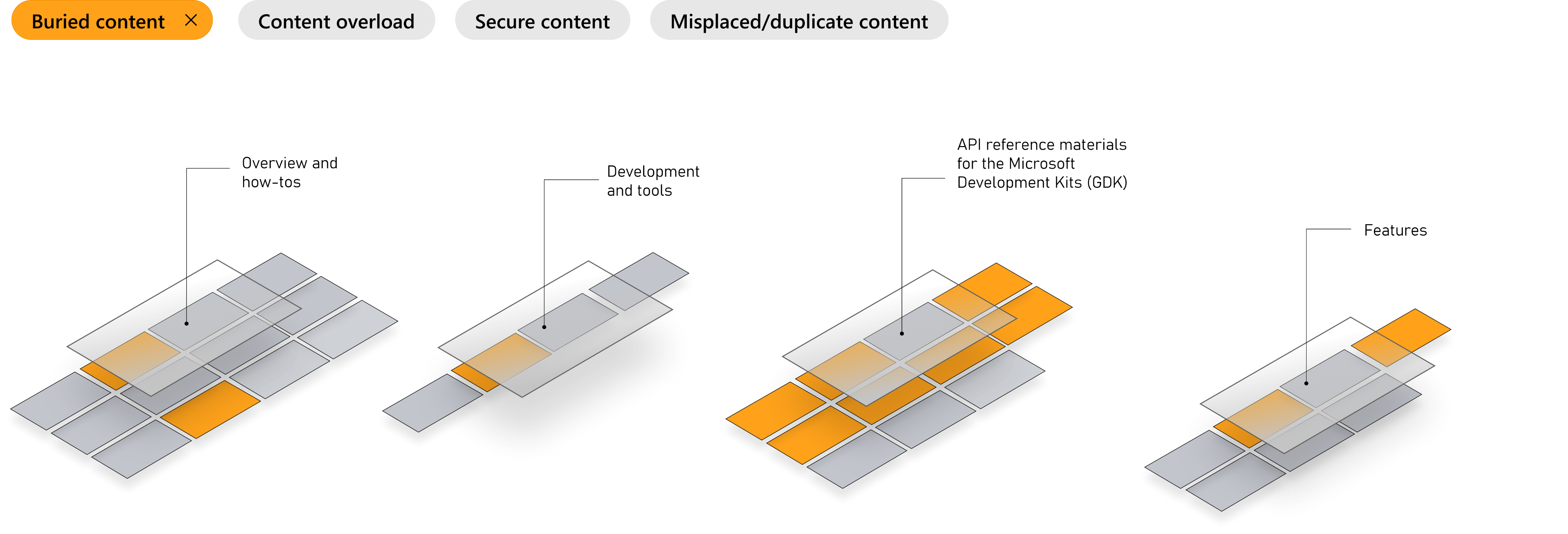
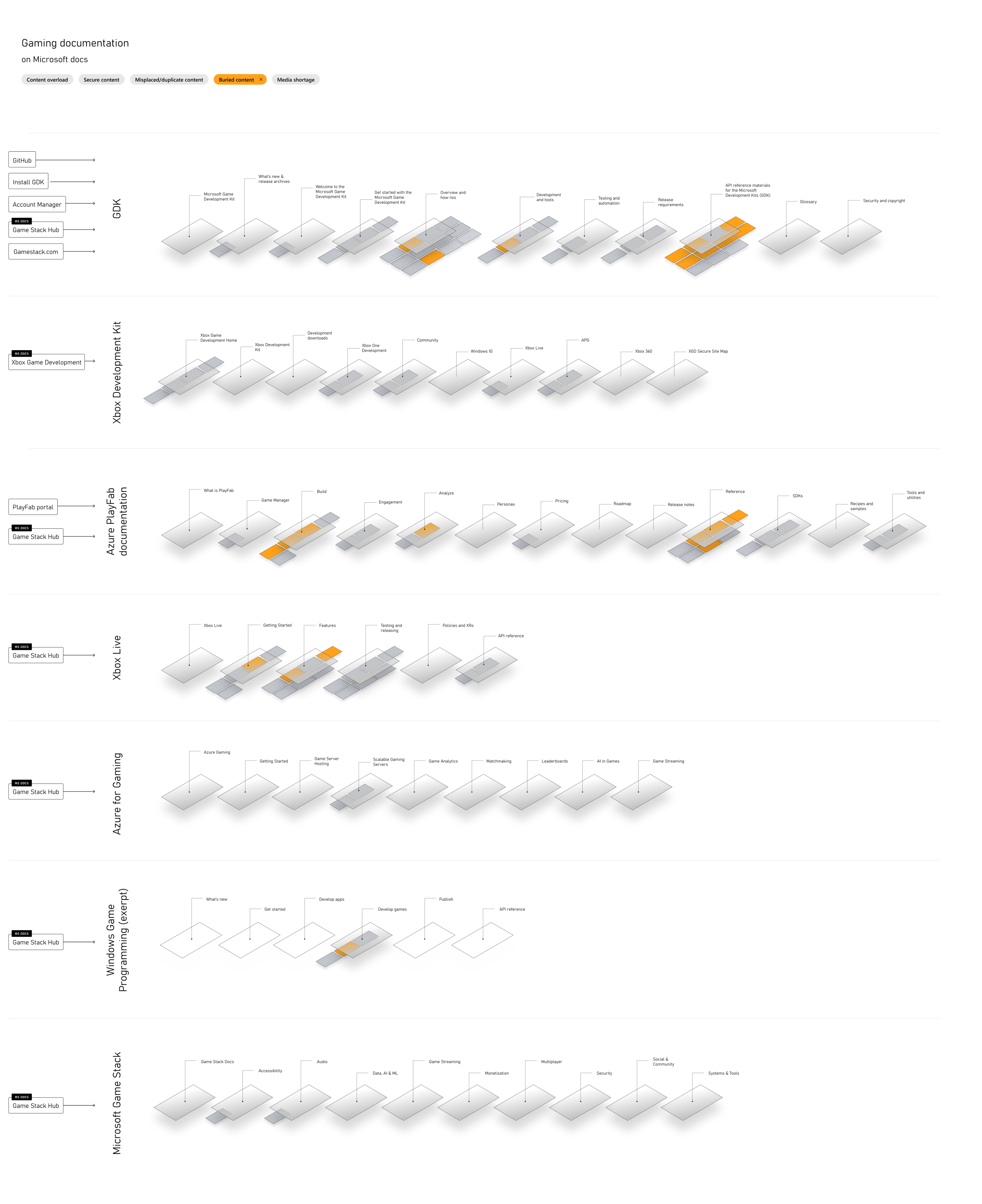
To visualize the scope of the problems, we used “problem filters” to show how prevalent the problems were in each section. Image courtesy of Megan S.
Research
Once we knew what we wanted to find out, we partnered with a dedicated researcher that helped us shape our questions for a small audience of game developers who frequently use our documentation.
Primarily, we wanted to understand how people found information they needed, moved through that documentation and really how they thought about it.
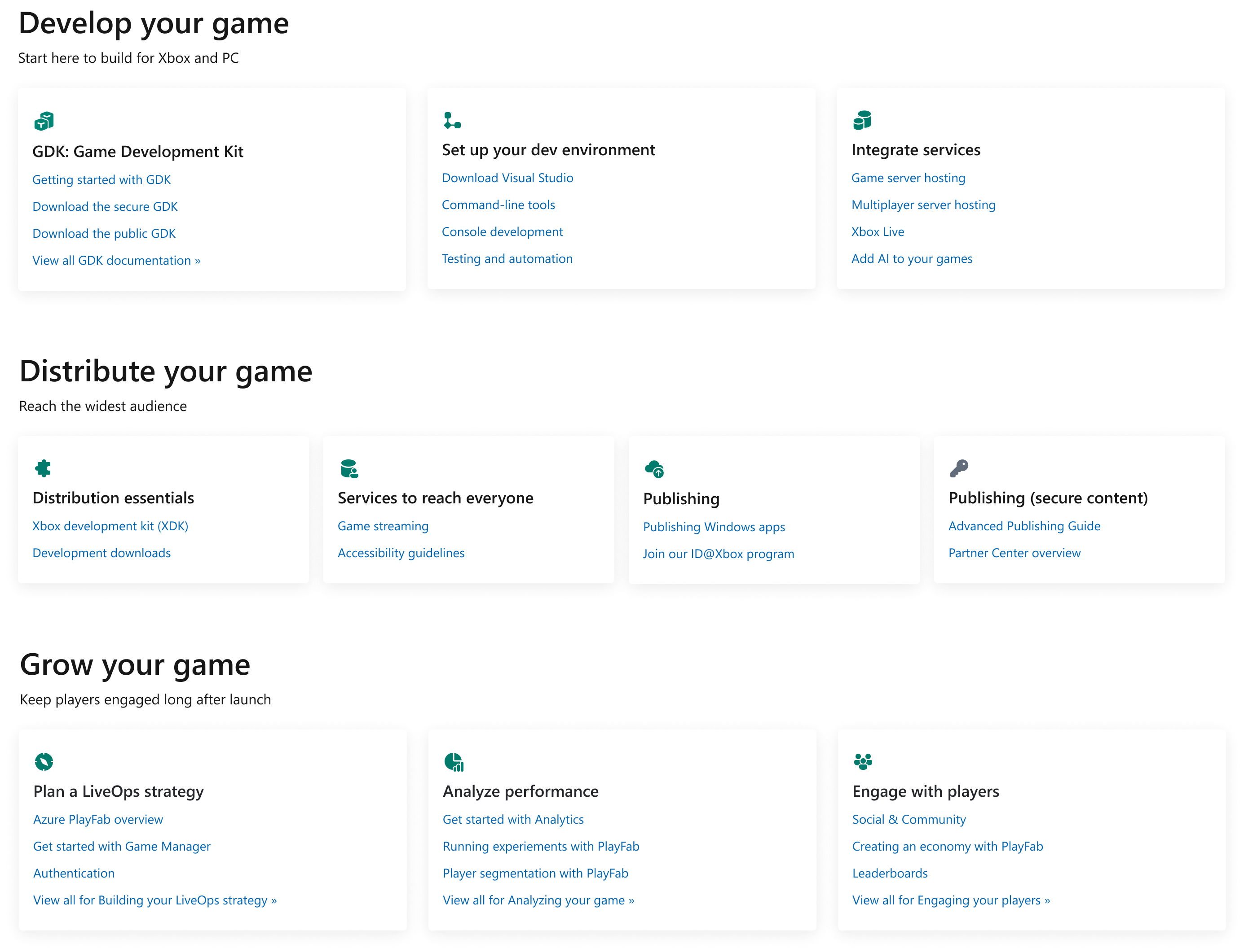
We landed on a mental model that aligned well with users. Instead of organizing information by type of tool or app, they generally moved through documentation based on what phase of game development they were in. So we took that and ran with it. Users could move though documentation more seamlessly.
Approach
I worked with another designer to redesign the documentation experience from the ground up, with a strong focus on usability, accessibility, and security:
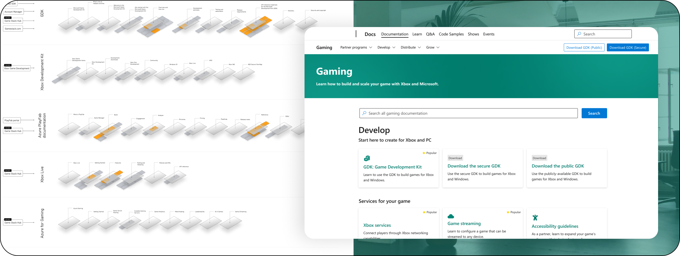
- Conducted audits of navigation patterns and user flows to identify where users dropped off or got stuck and visualized that.
- Introduced intelligent fallback experiences for restricted pages, helping users recover and redirect to relevant content. For authenticated and unauthenticated users.
- Reorganized information architecture and added search pattersn to make the platform more searchable and intuitive.
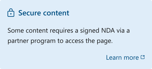
- Partnered with security and infrastructure teams to ensure the updated experience adhered to stringent post-SolarWinds security protocols.
“This helps solve a problem we’ve been dealing with for years.”
Outcome
- Achieved a significant reduction in bounce rate, signaling improved engagement and information access.
- The redesign positively impacted a core developer platform used by millions globally, reinforcing our credibility and utility.
- Resolved a longstanding and widely felt issue that had undermined user trust and efficiency for years.
- Enhanced the system’s resilience and compliance, delivering improvements without compromising on security which was a critical concern in the wake of high-profile breaches.
Created with beta software, there may be some bugs

Redesigning documentation to improve access, clarity, and security
On the heels of the SolarWinds security breach, there was a renewed effort in properly locking down content across the board. Along with my teammate Megan, we used this opportunity to solve some security issues as well as rethink how people consume documentation.
Role: Product design partner
Problems
Our documentation platform was suffering from serious usability and trust issues:
- Very high bounce rates indicated users weren’t engaging with or benefiting from the content.
- Users frequently landed on restricted or broken pages with no clear path forward, creating frustration and dead ends. This was also affecting overall bounce rate.
- Many users simply couldn’t find the information they needed, which led to repeated complaints, support tickets, and internal escalation.
- The issue had been a longstanding pain point that impacted both internal teams and the broader developer community.
To visualize the scope of the problems, we used “problem filters” to show how prevalent the problems were in each section. Image courtesy of Megan S.
Research
Once we knew what we wanted to find out, we partnered with a dedicated researcher that helped us shape our questions for a small audience of game developers who frequently use our documentation.
Primarily, we wanted to understand how people found information they needed, moved through that documentation and really how they thought about it.
We landed on a mental model that aligned well with users. Instead of organizing information by type of tool or app, they generally moved through documentation based on what phase of game development they were in. So we took that and ran with it. Users could move though documentation more seamlessly.
Approach
I worked with another designer to redesign the documentation experience from the ground up, with a strong focus on usability, accessibility, and security:
- Conducted audits of navigation patterns and user flows to identify where users dropped off or got stuck and visualized that.
- Introduced intelligent fallback experiences for restricted pages, helping users recover and redirect to relevant content. For authenticated and unauthenticated users.
- Reorganized information architecture and added search patterns to make the platform more searchable and intuitive.
“This helps solve a problem we’ve been dealing with for years.”
Outcome
- Achieved a significant reduction in bounce rate, signaling improved engagement and information access.
- The redesign positively impacted a core developer platform used by millions globally, reinforcing our credibility and utility.
- Resolved a longstanding and widely felt issue that had undermined user trust and efficiency for years.
- Enhanced the system’s resilience and compliance, delivering improvements without compromising on security which was a critical concern in the wake of high-profile breaches.